Thursday, December 31, 2009

Year Over Year Changes in UEMPMED


So how is the "recoveryless recovery" (seen written in all seriousness, can't make that up!) treating the hapless jobseeker now that we are seeing a decline in new claims?

Well, as of the November, 2009 data point not all that well. I decided to take a look at the year over year changes in the median duration of unemployment (UEMPMED). I chose that series over the Mean Duration (UEMPMEAN) so as to limit the impact of outliers and the pre-Great Recession chronically unemployed on the number.

What we are looking at is the amount of time in weeks in which 50% of the people move off of the UE rolls...and the amount of time required is accelerating through November on a year over year basis.

Data source:

St Louis Fed FRED: UEMPMED

Sunday, December 20, 2009

Industrial Capacity: Continuing Decline


We had another increase in industrial capacity utilization in the latest stats from the Fed, while we experienced the largest year over year percent decline in the data series going back to 1967 (so the year over year changes begin in 1968).

The industrial capacity also declined on a month over month basis for the eleventh consecutive month.

Data source:

FED Industrial Capacity data download

Friday, December 11, 2009

Rolling 12 Month Total - UE Final Payments


This is another case where the data had to be copy-pasted into a .csv and then imported into a spreadsheet to make the plot...it is the 12 month rolling total number of final UE benefit payment recipients, i.e. folks who have exhausted their standard 26 weeks of unemployment benefits over the previous year.

What struck me was the change in character of the peak count curve over time - what is quite a sharp peak after the first recession in the '70's (recall it is a twelve month total, so it will lag) becomes a somewhat broader peak in the double dip recession of the '80's, then it changes character significantly in the '90's recession becoming a much blunter and broader peak - and the final transformation into a plateau after the first recession of the '00's (double oughts?).

The question being, should the progression continue as the changes in the curve shape reflect broad changes in the makeup of the US economy and work force? And would that mean an even broader plateau at a much higher level now?

Thursday, December 10, 2009

Consumer Goods Imports - Year Over Year Changes


This is the M4 account from the Bureau of Economic Analysis (BEA), which is the quarterly nominal dollar amount of consumer goods ex-automobiles imported into the USA, non-seasonally adjusted. It would appear to have a nice uptick in 3Q 2009...


This type of unadjusted data, which exhibits strong seasonal behavior, is best reviewed on year over year basis and we see that in the plot above. This shows the "uptick" to be essentially entirely seasonal behavior as the 3Q 2009 as compared to the 3Q 2008 was down by ~-$18 billion


One approach to normalizing the absolute dollar amounts is to compare the year over year changes on a percent basis, which is displayed in the final plot above. Overall, it makes me wonder how big a holiday sales season could be had even if end demand was there...


Data source:BEA Balance of Payments

Wednesday, December 9, 2009

Personal Income Less Transfer Payments


So the 3rd quarter of 2009 was the start of the recovery, with a positive GDP that has been revised down once so far...looking at previous recessions and the call by NBER (using their quarterly dates) for the start and end of recessions, unless the private income less transfer payments starts seriously ticking up on on a year over year basis - that call may be awhile in coming...


Data sources:
BEA NIPA Tables - Section 2 Table 2.1 is the one you want
NBER Recession Dates

Monday, December 7, 2009

Consumer Credit - Continued Declines


Quick plot ginned up on FRED - what we see appears to be a continuing acceleration in the year over year decline in revolving consumer credit... ho ho ho...

Tuesday, November 17, 2009

Industrial Production - Capacity and Utilization Rate


We just had the latest industrial capacity utilization rate released, with a microscopic 0.1% uptick in capacity utilization month over month...but are things getting busier, or are we shedding capacity faster?


This is a look at the year over year change in the industrial capacity from the Fed, using the total index. Looks like we set another record here...

Monday, November 16, 2009

Year Over Year Change in Total Revolving Credit Outstanding


This is total revolving credit, non-seasonally adjusted. When you look at the data month over month there is strong seasonality exhibited, so the non-seasonally adjusted numbers are best viewed year over year.

When the retail season is considered, let's look at private wage income, revolving credit and...? Any suggestions welcome to answer the question, "Show me the money?" - what the heck are consumers going to spend?

Monday, November 9, 2009

Personal Income: Private Wages Year Over Year Change


An assertion was made regarding private sector wages going up - can't see it from this data from NIPA Table 2.1...

Saturday, November 7, 2009

U-6 Update


So here is the latest U-6, unadjusted 16.3% which becomes a seasonally adjusted 17.5%


Now we examine the year over year change in the unadjusted U-6, and while the rate of change is declining from the peak (due to the elevated prior year base now that we are almost two years into this recession) it is still in excess of the peak from the prior recession. Also, recall that the absolute level of U-6 unemployment is still increasing year over year until the graph goes below the 0% line.


The spread between U-3 and U-6 remains elevated.

EMRATIO - Continued negative acceleration Year Over Year


Almost two years into the recession, the rate of the year over year decline in the EMRATIO is actually accelerating...using the most recent recession as a guide, the peak rate of change for EMRATIO occurred about 36% of the way through the EMRATIO decline associated with that recession. If this month is the peak year over year rate of change and that relationship holds, then we would begin to see improvements in EMRATIO about 51 months from October, 2009 or about January, 2014.

Thursday, October 29, 2009

Yep, its that bad


After some crosstalk with fellow members of the commentariat at Calculated Risk, one remark was "Are you sure? It can't be that bad!"

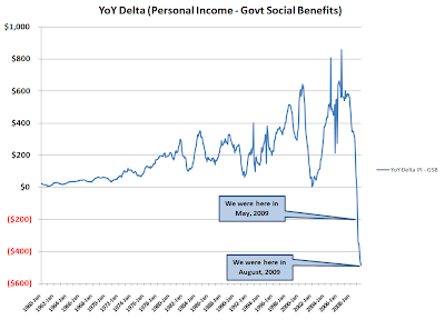
So I made a clean download of the data from the Bureau of Economic Analysis (BEA) Table 2.1 (FD: well, I took all the Section 2 tables because I could). From Line 1, Personal Income I subtracted Line 17, Government Social Benefits to Persons. I then Q1 from the first year of the series from Q1 of the second year of the series and then copy/pasted to the end of the data...producing the graph above (with at least the y-axis labeled, another hat tip to RATM).

Yes, it's that bad.

BEA NIPA Tables


Edit: after some discussions regarding normalization, here is the (YoY change in personal income - govt benefit payments)/(personal income - govt benefit payments)

Continued Deterioration in Personal Income - Govt Social Benefits


(NB: Y-axis is in billions of USD - hat tip RATM)
Well we had our 3.5% preliminary GDP number out this morning, so what is the sustainability of this "recovery?" Given how central consumption is to the economy, how has the personal income of my fellow citizens been doing - and not just the headline number, but what is personal income less government social benefit transfer payments?

Data from the latest BEA release, soon to be updated with September numbers (NIPA Table 2.1)
Download MS Excel Table with 2009 values

Link to previous post on topic

Monday, October 26, 2009

Time normalized data for CDC US Outpatient Influenza Surveillance: 1997-present


This is the publicly available data from CDC, current up to the end of week 41 (October 11-17, 2009).

CDC Current Weekly FluView Report
Archive of FluView Weekly Reports
CDC Historic Influenza Surveillance Data
Notes on the CDC data:
1. Some years contain a "week 53", the years without week 53 do not have that data point.
2. Some of the years only have data from week 40 to week 20 (approximately the months of October-April).
3. Starting in 2003-2004 influenza season data, the CDC began providing a weighted % ILI value, which is the data used in the plots from 2004 forward. Prior years use the unweighted CDC reported value.

Thursday, October 15, 2009

Treasury Marketable Debt Rollover Update


Well it's a "good news/bad news" story...the average tenor of the outstanding marketable debt has decreased as both the one quarter and cumulative two quarter rollover amount of debt have decreased. On the other hand, the marketable debt outstanding has increased by 6.0% over 3Q2009, slightly faster than the 5.6% increase in marketable debt in 2Q2009 (current quarter annualizes at ~26% rate of increase).

Though in examining the "good news", one wonders who is buying the long end of the curve at the current yields, when the information available in the press is that foreign central banks are moving to the shorter end...[sighs] ok maybe I'm not wondering too much...


Previous posts on Treasury marketable debt maturity:
2Q2009 Update
1Q2009 Update
4Q2008

Saturday, October 3, 2009

EMRATIO - return to cliff diving?


The monthly reported value of EMRATIO took a relatively big leg down month over month of -0.4% in September, and the year over year comparison of the 3 month moving average is even more disconcerting as it represents the largest decrease for this recession and the seventh new all time record for the series...


Link to FRED for EMRATIO

Monday, September 28, 2009

Credit Growth in the Commerical Paper Market


Triggered by a Calculated Risk post on credit market indicators, this provides me with more information than the 30 day spread with respect to the commercial paper market...

Monday, August 24, 2009

Deficit as a % of Spending


A couple of critiques I received to the eye popping deficit plot I posted related to the nominal nature of the dollar values and the % of GDP etc. After some thought, there seemed to be some merit to the normalization over time argument, thought I think the % of expdenditures by the government is more meaningful than the GDP argument...for your viewing "pleasure".

Saturday, August 22, 2009

U-6 Unemployment Stats Revisited


Here we have the unadjusted U-6 unemployment data, which hasn't been around all that long so the plots only go back a relatively short time. Also, I am looking at the Year Over Year (YoY) changes, so there is additional truncation of the first twelve months to keep the plots' timeframes aligned. There is clear seasonality exhibited, and the YoY look tells you what the changes are without muddying the waters with seasonal adjustments (inadvertantly or...advertantly?).


So looking at the YoY changes in both absolute and as a percentage change (new - old)/(old)can give some perspective on the rate of change, as evaluating the impact of a change is a function of both magnitude and the time it takes...and we can relate that to the previous plot of the U-6 unemployment rate.


Finally, I am still working out what the change in the relationship between the U-3 unadjusted rate of unemployment (the headline rate of unemployment) and the U-6 unadjusted rate means, but my WAG is that it is trying to tell us that the headline UE rate is understating the degree of economic distress being experienced by wage earners.

Wednesday, August 19, 2009

Distribution of Real Income Growth since 1980


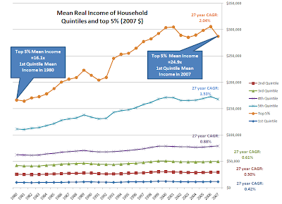
Here is real income growth for households since 1980 in 2007 dollars showing the mean value for income in each quintile and the mean income for the top 5%, as found in the US Census Bureau Historical Income Tables - Households (Table H-3).


Link US Census data


Cost plot courtesy of Wiki, the spread above the CPI line shows how much real costs grew, and compare those rates to the real income growth rates above. The bow on the package would be debt, and the growth in debt service payments.
Link Wiki Inlation, Tuition, Medical Cares since 1978

Tuesday, August 18, 2009

Saturday, August 15, 2009

EMRATIO - 3 Mo MA YoY Decline - Continued Uncharted Territory


The journey into uncharted territory for the year over year change in EMRATIO continues - this is the monthly series from the St. Louis Fed, the Civilian Population to Employment ratio - smoothed into a 3 month moving average (3 Mo MA) and then subtracting the previous year's monthly measure to get the delta...

Uuuuuuuuugly continues to be the name of the game, for the sixth consecutive month the YoY change has matched or exceeded the previous record from 1954 by an increasing amount each month.

In comparing to previous recessions, the two most recent prior to the current recession would seem to be the best analogs with respect to the structure of civilian employment (service vs. manufacturing in particular). If the duration of YoY declines is at all analogous, this is going to deteriorate for an extended period of time - the peak declines for the previous two recessions occurred 31% to 36% of the way through the decline in 3 Mo MA of EMRATIO - measuring from the start of the EMRATIO declines six months prior to the declared recession start date, there could be 46 to 58 more months of YoY declines in the 3 Mo MA of EMRATIO from July, 2009...


(N.B.: When reading the graph, anything below the black line represents deterioration - as we approach from below, things continue to decline only more slowly - actual gains do not occur until the value is above the black line)

Thursday, August 13, 2009

UI Exhaustion Rate - Declines As Monthly Total Climbs


So running through the DOL stats on the exhaustion rate for UI (the current final UI payments over the 26 week lagged initial payments), the only accessible value is a 12 month average that looked like it was experiencing some compression (barely went up this month from last month).


So I grabbed some numbers (had to copy/paste into a .csv and then bring into a spreadsheet). I expect we will see/are seeing some declines in the monthly exhaustion rate due to the huge ramp in the number of initial payments six months ago - while the monthly total of final payments continues its exponential climb. There will be lots more folks falling off the backside of continuing claims due to that bulge in initial payments starting last December...want to see continuing claims plus extended claims...


DOL Monthly Data


UPDATE

As is indeed the case, the large influx is making the exhaustion rate go down - for the moment - but it is just putting more folks in the pipeline as potential future "exhaustees"...

Saturday, July 11, 2009

Treasury Marketable Debt Rollover Update


Here is the quarterly update to the Treasury rollover plot. "Good news" in the sense of being less bad, as the rate of increase has slowed on a quarterly basis and the maturity distribution of the change improved - unlike last quarter, the front quarter rollover grew at a slower pace than the total.


What is still distressing is the rate of growth. While the QoQ rate of growth declined to 5.6% from the previous quarter's 8.1%, this still annualizes out to ~24% growth rate (a three year doubling time for the marketable debt). As I like to look at YoY growth rates, I checked that and may go back to work up a recent YoY growth rate history...2Q YoY growth was 41%.


Previous US Treasury marketable debt posts
1Q 2009 update
4Q 2008 post

Saturday, July 4, 2009

EMRATIO Year Over Year Decline - Uncharted Waters


In keeping with the KISS principle, I am currently paring back my different views of unemployment to the EMRATIO data from the St. Louis Fed FRED series...


Short version: the current rate of change for job losses as measured by the EMRATIO, or civilian employment to population, exceeds everything on the books by a wide margin - the energy shock recessions of the '70's, the double dip of the'80's - which appears to be even worse than it might otherwise seem as the economy is now strucuturally far more dependent on wage supported spending power.

Thursday, July 2, 2009

BLS Birth/Death Model - 3 Month Cumulative Impact


Lots of discussion on the net effects of the Birth/Death model, here is my modest contribution. For the last three months, the cumulative impact of the B/D model has been to reduce the reported job loss by a third - there's your green shoot right there...

Friday, June 26, 2009

Personal Income Less Government Social Benefits - YoY Delta


More uncharted terrain - was reading some comment by-play on Calculated Risk, and the question of how good the two month uptick in Personal Income is was in play - for me, it is always back to the Year Over Year look as usual...


Hard to say things are improving by my lights...

Friday, June 12, 2009

Commercial Paper Outstandings - Wile E. Coyote Lives!

This first plot is from the Fed's latest release on the outstanding balance of commercial paper...
So what does that look like on a Year Over Year basis using the 3 month moving average, you say?


Green shoots indeed...

Wednesday, May 6, 2009

A/H1N1 Weekly Post 06 May 2009


Changing to a weekly view on this as it appears all of North America is in sustained community transmission mode. If this follows typical seasonal patterns it should start to trail off soon...otherwise, the peak new cases in the USA should occur around the end of June if the start was in the beginning of March (based on R0 of 1.6 and a world of other assumptions)

Hence the weekly view - here's hoping all the scoffers are correct - for this wave and in the Fall.


Image updated for Canada 06 May 2009 number (PHAC)


Adding link to unedited transcript of CDC presser today: http://tickerforum.org/cgi-ticker/akcs-www?post=94020

Adding link: WHO updated guidance on pandemic preparedness and response http://www.who.int/csr/disease/influenza/PIPGuidance09.pdf

Sunday, May 3, 2009

Lab Confirmed A/H1N1 Cases - update


Latest numbers gleaned from WHO, CDC, ECDC, PHAC...


Added link: ht to Market Ticker Forum unedited CDC transcript from this afternoon http://tickerforum.org/cgi-ticker/akcs-www?post=93578


Data request: Any curves similar to figure 2 in this ECDC paper - unfortunately this curve applies to the second wave of the 1918 influenza with an R0 of >3... need similar for R0=1.6 and R0=2.4 http://www.ecdc.europa.eu/en/files/pdf/Health_topics/Lessons_from_previous_pandemics.pdf

Great paper, hat tip Wisdom Speaker - translating the data from the log plots in this paper to the format from the ECDC paper is what I would truly like to see... http://www.pnas.org/content/103/15/5935.full.pdf+html

Saturday, May 2, 2009

Laboratory Confirmed A/H1N1 Cases - update


Already out of date from earlier this afternoon, country count is now 18, with South Korea added to the list...press reports 809 confirmed cases worldwide, with 197 in the USA.

Friday, May 1, 2009

Laboratory Confirmed A/H1N1 Cases - Update


Daily update, added some data sources beyond WHO as the update cycles are now hopelessly out of sync...huge spike in Mexico confirmed cases is likley a function of clearing out a testing backlog.


If you want to go directly to the data sources:

Wednesday, April 29, 2009

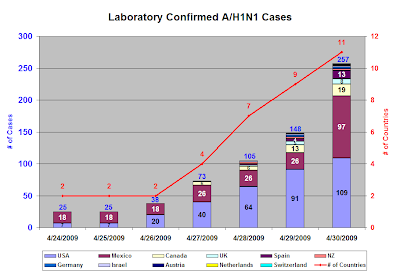
WHO Laboratory Confirmed A/H1N1 Cases


Well the World Health Organization just raised the Pandemic Alert Level to 5 from 4 (the raise to 4 was yesterday). Here is a graph of the laboratory confirmed cases of A/H1Na1, the flu previously known as "Swine."