Thursday, April 15, 2010

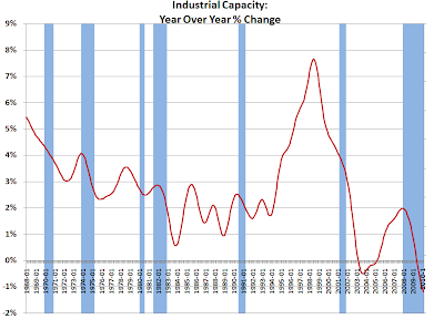
Industrial Capacity - More Record YoY Declines


Industrial capacity utilization rate was released today, along with industrial production. We continue to see record year over year declines in industrial capacity, now for the seventh consecutive month.

The headline year over year change in industrial capacity utilization was +3.7%, an about 25% of that increase is due to reducing the denominator, the decline in total industrial capacity. I decomposed the change by taking current industrial production and dividing it by the industrial capacity of a year ago to arrive at the +2.7%.

Wednesday, April 14, 2010

Retail Sales ex-Autos and State Sales Tax Receipts - correction (ht josap)


So here we are in the midst of a 'robust retail recovery', which unfortunately has yet to be manifested in the state sales tax receipts. Unfortunately, the most authoritative source of data there is provided quarterly and that at a modest lag...

So here we have a plot of the year over year change of 3 month moving average of retail sales ex-autos (RSFSXMV 3 mo MA) courtesy of the FRB FRED, and the year over year change in quarterly state sales tax receipts courtesy of the Rockefeller Institute of Government - if anyone can get the full time series of their data that would be great, but the current data set is limited to their most recent publication.

What the data set shows is the two curves as lines, and the faint green bars are the variance between the two. The average variance is -2.0% over the time period of the plot, and the most recent observation for 4Q2009 is -2.1%. Of interest is a quarterly breakout of the impacts of tax rate increases on total sales tax revenues, please post any information available in comments.

Technical notes: The RSFSXMV series is monthly, and a rolling 3 month cumulative total and the annual difference is calculated. The year over year change in quarterly state sales taxes are taken as is from the Rockefeller Institute, and then the monthly positions are a linear interpolation between those observations. The observed values were placed in the middle month of each quarter. [NB: Hat tip to josap who got me to re-examine my plot and so find a calculation bust!]

Monday, April 12, 2010

Personal Income and Transfer Receipts


Here is an update and refinement of the look at personal income less transfer receipts from the BEA NIPA Table 2.1.

A few observations:
1. On the way up, the personal income gains occurred primarily at the upper income ranges (some might say in a disproportionate manner).
2. On the way down, the personal income losses are falling most heavily on the lower income ranges (op cit).
3. 4Q2009 does not look like 'recovery' to me. We should see some slower rates of decline in 1Q2010, but that will be the first year on year comparison to the 1Q2009, the start of the 'cliff dive.'


The question occurred to me, what is the proportion of the transfer receipts to the personal income less transfer receipts? This seems pertinent to me as 98.5% of the transfer receipts are government social benefit payments to persons...

Friday, April 9, 2010

Marketable Treasury Debt Maturity - 1Q2010 Update


Looking at the debt held by the public, the front two quarters of Treasury roll has ballooned back up to just a hair under where it was this time a year ago. Over the quarter just passed, the marketable debt increased by 6.7%, which annualizes at ~29% rate of increase. This is also improvement from this quarter a year ago, when the quarterly rate of increase annualized at ~37%!

The actual increase on a year over year basis was $1.49 trillion of publicly held marketable debt, or a 23.9% increase. Again, my focus is just on the publicly held portion.

4Q2009 Update
3Q2009 Update
2Q2009 Update
1Q2009 Update
4Q2008

Data Source: Treasury Direct March 2010 MSPD

Wednesday, April 7, 2010

Charge Off and Delinquency Rates


In the previous two recessions that the time series covers, it appears the combined delinquency and charge off rates peaked within one quarter after the end of the recession.

The line plot is stacked, so the current combined rate in excess of 10% is the sum of the 3.04% charge off rate and the 7.42% delinquency rate (likewise for the year over year changes).

This might also serve as a supporting argument for why the unemployment rate (and underemployment rate) are now leading indicators...as they will be the primary driver for cure vs write off for the delinquencies (absent the Fed assuming the balance sheet of the entire private sector).

Data Source:
FRB CHGDEL Data Download Page

Tuesday, April 6, 2010

Year Over Year Decline in LOANS - New Record


So here we have more Fed FRED data, also in release H.8, specifically LOANS: Total Loans and Leases at Commercial Banks.

The most current data at this time is from February, 2010 and we can observe a new record decline on percent year over year basis.

It appears that the year over year change typically reaches a local minima from one to six months after the end of a recession, though the early '90s recession breaks this pattern. If the end of the recession was July, 2009 than this should start turning up...well, last month but if not this month...well, if not next month...

Sunday, April 4, 2010

U-6 - U-3 Spread NSA - Update


The spread between the non-seasonally adjusted numbers for U-6 - U-3 set a new record in February, at 7.5%. The value for the spread in March is 7.3%.

I have been arguing for some time that the UE rates and persistence are not lagging indicators but rather harbingers...but more on a gut basis rather than with any quantitative arguments. So this is an initial foray in that direction.

The old saw about UE being a lagging indicator is fundamentally based on the idea that things are going to go along in "Business As Usual" (BAU) mode. The dramatic elevation of the spread between U-6 and U-3 indicate that significant structural changes in employment markets are afoot.

The quantitative argument rests on the assumption of a normally distributed spread around the mean value, which may be questionable but not unreasonable (particularly from a simplistic BAU framework).

If we restrict BAU as the period prior to the start of this recession, the spread has a mean of 3.64% and a standard deviation of 0.42% which means the probability of seeing the current spread of 7.3% would occur once each 6.2 x 10^16 observations (monthly), or once every 5.1 x 10^15 years or so...without getting into the significant issues of autocorrelation for this series (the previous month's observation has significant predictive value for the next month's observation).

If we take a more expansive view of BAU as including the perturbations of the current recession then we experience a mean of 4.08% with a standard deviation of 1.13%, which would put the probability of the current spread at once each 159 observations, or once every 13.2 years.

No doubt the econometric police will shower me with approbation for this exercise, however it seems like the most direct way to make a quantitative argument that there are profound structural changes underway in the labor market and prism of recent experience during the expansion of the FIRE segment of the economy is a poor guide for the future.

Friday, April 2, 2010

UEMPMEAN - 3 Month Moving Average Year Over Year Changes


This is not a lagging indicator...

Industrial Capacity - Continuing Record Declines


So we have had lots of play for the increases in the rate of industrial capacity utilization, but no play at all regarding the state of industrial capacity.

Short version: industrial capacity is going away at a faster rate than at any other period in the historical time series - which starts in 1967, so 1968 in terms of measuring year over year changes (Fed unique identifier: G17/CAP/CAP.B50001.S).

This month is another record in two ways - for the sixth straight month in a row - both the month over month decline and the year over year decline is the largest on record.