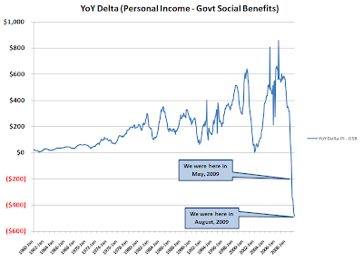
After some crosstalk with fellow members of the commentariat at Calculated Risk, one remark was "Are you sure? It can't be that bad!"
So I made a clean download of the data from the Bureau of Economic Analysis (BEA) Table 2.1 (FD: well, I took all the Section 2 tables because I could). From Line 1, Personal Income I subtracted Line 17, Government Social Benefits to Persons. I then Q1 from the first year of the series from Q1 of the second year of the series and then copy/pasted to the end of the data...producing the graph above (with at least the y-axis labeled, another hat tip to RATM).
Yes, it's that bad.
BEA NIPA Tables
Edit: after some discussions regarding normalization, here is the (YoY change in personal income - govt benefit payments)/(personal income - govt benefit payments)


