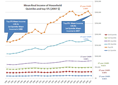
Here is real income growth for households since 1980 in 2007 dollars showing the mean value for income in each quintile and the mean income for the top 5%, as found in the US Census Bureau Historical Income Tables - Households (Table H-3).
Link US Census data

Cost plot courtesy of Wiki, the spread above the CPI line shows how much real costs grew, and compare those rates to the real income growth rates above. The bow on the package would be debt, and the growth in debt service payments.
Link Wiki Inlation, Tuition, Medical Cares since 1978
2 comments:
Looks like the rich are making their bid for Pareto Optimality.
EE- If you could plot the first graph on a log scale, I believe that it would better show the percentage differences among the various groups.
Post a Comment