Monday, August 24, 2009
Deficit as a % of Spending
A couple of critiques I received to the eye popping deficit plot I posted related to the nominal nature of the dollar values and the % of GDP etc. After some thought, there seemed to be some merit to the normalization over time argument, thought I think the % of expdenditures by the government is more meaningful than the GDP argument...for your viewing "pleasure".
Saturday, August 22, 2009
U-6 Unemployment Stats Revisited
Here we have the unadjusted U-6 unemployment data, which hasn't been around all that long so the plots only go back a relatively short time. Also, I am looking at the Year Over Year (YoY) changes, so there is additional truncation of the first twelve months to keep the plots' timeframes aligned. There is clear seasonality exhibited, and the YoY look tells you what the changes are without muddying the waters with seasonal adjustments (inadvertantly or...advertantly?).
So looking at the YoY changes in both absolute and as a percentage change (new - old)/(old)can give some perspective on the rate of change, as evaluating the impact of a change is a function of both magnitude and the time it takes...and we can relate that to the previous plot of the U-6 unemployment rate.
Finally, I am still working out what the change in the relationship between the U-3 unadjusted rate of unemployment (the headline rate of unemployment) and the U-6 unadjusted rate means, but my WAG is that it is trying to tell us that the headline UE rate is understating the degree of economic distress being experienced by wage earners.
Wednesday, August 19, 2009
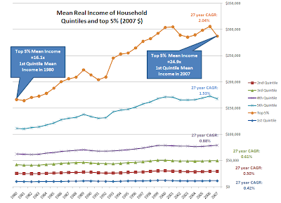
Distribution of Real Income Growth since 1980
Here is real income growth for households since 1980 in 2007 dollars showing the mean value for income in each quintile and the mean income for the top 5%, as found in the US Census Bureau Historical Income Tables - Households (Table H-3).
Link US Census data
Cost plot courtesy of Wiki, the spread above the CPI line shows how much real costs grew, and compare those rates to the real income growth rates above. The bow on the package would be debt, and the growth in debt service payments.
Link Wiki Inlation, Tuition, Medical Cares since 1978
Tuesday, August 18, 2009
Saturday, August 15, 2009
EMRATIO - 3 Mo MA YoY Decline - Continued Uncharted Territory
The journey into uncharted territory for the year over year change in EMRATIO continues - this is the monthly series from the St. Louis Fed, the Civilian Population to Employment ratio - smoothed into a 3 month moving average (3 Mo MA) and then subtracting the previous year's monthly measure to get the delta...
Uuuuuuuuugly continues to be the name of the game, for the sixth consecutive month the YoY change has matched or exceeded the previous record from 1954 by an increasing amount each month.
In comparing to previous recessions, the two most recent prior to the current recession would seem to be the best analogs with respect to the structure of civilian employment (service vs. manufacturing in particular). If the duration of YoY declines is at all analogous, this is going to deteriorate for an extended period of time - the peak declines for the previous two recessions occurred 31% to 36% of the way through the decline in 3 Mo MA of EMRATIO - measuring from the start of the EMRATIO declines six months prior to the declared recession start date, there could be 46 to 58 more months of YoY declines in the 3 Mo MA of EMRATIO from July, 2009...
(N.B.: When reading the graph, anything below the black line represents deterioration - as we approach from below, things continue to decline only more slowly - actual gains do not occur until the value is above the black line)
Thursday, August 13, 2009
UI Exhaustion Rate - Declines As Monthly Total Climbs
So running through the DOL stats on the exhaustion rate for UI (the current final UI payments over the 26 week lagged initial payments), the only accessible value is a 12 month average that looked like it was experiencing some compression (barely went up this month from last month).
So I grabbed some numbers (had to copy/paste into a .csv and then bring into a spreadsheet). I expect we will see/are seeing some declines in the monthly exhaustion rate due to the huge ramp in the number of initial payments six months ago - while the monthly total of final payments continues its exponential climb. There will be lots more folks falling off the backside of continuing claims due to that bulge in initial payments starting last December...want to see continuing claims plus extended claims...
DOL Monthly Data
UPDATE
As is indeed the case, the large influx is making the exhaustion rate go down - for the moment - but it is just putting more folks in the pipeline as potential future "exhaustees"...
Subscribe to:
Posts (Atom)