Wednesday, April 27, 2011

Daily Trading Volume for SLV


This post began as a conversation with a data request to the commentariat over at Calculated Risk, and exists because of the generous assistance of Mike in Long Island - hats off to you, Mike!

It seemed to me that the daily volume of shares traded in the silver ETF SLV was quite high, but I did not have the time series data of the daily shares outstanding (a moving target with an ETF such as SLV).

So, from the start of 2010 through today, is the daily shares outstanding (right axis, in blue) and the percent of those shares outstanding that the daily trading volume represents (left axis, in red). For comparison the total arithmetic average is included along with a monthly moving average.

Readers may draw their own conclusions, but there appears to be two distinct periods with the higher volume period starting around the beginning of November, 2010. And recently, the daily traded volume has been quite high compared to the rest of the data in the time period covered.

Saturday, February 12, 2011

Median Unemployment Duration by Age Cohort


Okay, can BLS make it any more difficult to get at this data? grumble grumble rippensnatz... I ahd to end up going to some ftp directory and extracting data to flat files then import to MS Excel - bug or feature?

The data shows the other side of the UE story, that while the UE rate among the youngest cohort is the highest, the duration of that UE is the lowest. In addition to the 16 to 19 cohort, I emphasize the 44 to 55 cohort as that represents peak earning years. But among all cohorts we see increasing median duration of UE with increasing age.

So there appears to be another strong predictor of UE duration, a person's age (the other being the duration itself, the longer unemployed the likelier to remain there).


And here is what the absolute numbers look like for 27+ weeks UE duration by age cohort...

Thursday, February 10, 2011

Different This Time - More on Labor Force Declines

As the population grows each year, how have they moved into the economy? Are things different this time?

Starting with BLS annual data for Civilian noninstitutional population 16 years and over, Civlian labor force 16 years and over and Not in labor force 16 years and over I took the year over changes for each series and constructed plots:


Looking at the changes in the over 16 population and labor force, we see only three years in which the year over year change in the labor force was negative - 1951, 2009 and 2010 - and the 1951 event is characterized by the only year over year decline in the civilian population. In fact, the year over year change for all three series was negative in 1951. This is not the case in 2009 and 20010, where there is ~1% population growth, year over year declines in the labor force, and year over year increases in not in the labor force (seen in following graph).


Here we see the population changes and the not in labor force changes, and there are three years that stand out for the increase in not in the labor force being greater than the increase in population (excepting 1951 op cit) - 1976, 2009 and 2010 - with by far the largest outlier being the 1976 data point.


In summary, it is clearly different this time, as only 2009 and 2010 year over year changes show consecutive declines in the size of the labor force and consecutive year over year increases in the not in labor force greater than the increases in population.

Monday, February 7, 2011

Continuing Declines in Labor Force Participation Rate


The plot above shows the 4 week moving average of the seasonally adjusted weekly Initial Claims numbers, and that same curve shifted forward 99 weeks, showing that the peak number of '99ers' is now rolling off the back end of their extended benefits. There appears to be a relationship with the decline in the labor force participation rate also shown above, which looks a tad strange as it is a monthly series and ICSA is a weekly series.

We can see that the labor force particpation rate began to decline around six months to a year after the ICSA began to ramp up.


UEMPMEAN appears to have a strong relationship with the declines in the labor force participation rate, and the average duration is likely to continue to rise as it appears the probability of remaining unemployed has become in part of function of unemployment duration... the longer you are unemployed, the likelier you are to remain that way.

Both of these suggest to me that we will continue to see declines in the labor force pariticipation rate... which might well drive the U-3 headline unemployment rate but for all the wrong reasons.

Tuesday, September 28, 2010

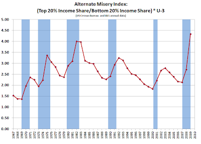
Alternate Misery Index


OK, so the commentariat over at Calculated Risk was kicking around conceps for an alternate misery index (or at least cinco-x and myself). If you will recall, the original misery index is the sum of the unemployment rate and the rate of inflation (Okun).

But in ZIRP world, inflation is not much of a factor even though misery we got aplenty, so what might be another approach to quantifying that? Above is one alternative, taking annual data from BLS for U-3 unemployment (well, that was monthly data taking an annual arithmetic average) and Census data for the ratio of the income share of the top 20% to the income share of the bottom 20% for the USA.

I think the 2010 numbers will be pretty close to the current set, so a conjecture for 2010 would be an approximately level line segment from 2009... though the most striking thing to me was the rate of change 2008-2009, I think the ripples are still propagating across the pond on that.

Friday, September 17, 2010

Household Formation and USA Population Changes


I'm still trying to figure out if this is just a descriptive statistics exercise or whether it may also inform on another level, but this is taking Census data for the number of households and the total population of the USA and looking at the ratio of the annual change in the number of households over the annual change in the population.

It is interesting to note that in some years, the number of households added exceeded the number of people added, so there are multiple factors in play... perhaps the most significant of which was the coming of age of boomer cohort members (with respect to the household formation rate). Any thoughts appreciated.

Friday, September 3, 2010

Decline in UEMPMED - Labor Market Deterioration?

So we saw a sharp decline in the median duration of unemployment with today's data release from the St. Louis Fed FRED database (mad propz to FRED!). Is this really an indication of improvements in the labor market in the USA?

Here we have the data series from FRED for the unemployed, segmented by duration. It is a bit busy, so what we are looking at here is the proportion of the 100% of the unemployed that each duration segment is contributing to that total...with the absolute number of each segment as the label for each month as well.

With respect to the longest term unemployed data segment, 27 Weeks and Over, is declining in both the absolute number and the relative contribution. On a month over month basis, the trend is also solidly in decline. But is the reason for this decline improvements in the labor market or workers exiting the labor force?

Looking at the change in PAYEMS, the total non-farm payroll in thousands of employees, the answer appears to be exit...


And finally, as a lagniappe for a negative interpretaion of the decline in UEMPMED, it appears that there was a big jump in the in the unemployed between 1-3 months, UEMP5TO14.


To recap on reasons for the decline in UEMPMED:
1. The longest term unemployed are declining according to the current counting methodology
2. They are almost certainly exiting the labor force as non-farm payrolls are flat over the period of the big declines in UEMPMED
3. A significant increase in the UE duration segment of between 1-3 months is also pulling the median down