Friday, July 8, 2011

UEMPMEAN - UEMPMED: Structural Unemployment


So using the mean and median weeks of unemployment time series data from the Fed FRED, here is what the spread between the mean time and median time looks like... so as mean times increase relative to median times, this would seem to indicate either a larger sub-group of long term unemployed, or that sub-group is experiencing longer durations of unemployment, or both.

What changed in the 2001 recession that resulted in a higher floor for the spread?

Tuesday, July 5, 2011

US Regular Gasoline Price - Perspective


Courtesy of the EIA data set on the monthly average price for regular gasoline, above is a plot of the 12 month moving average...

Wednesday, May 18, 2011

SLV % of Shares Outstanding Traded Daily Redux


First, we have about a 16 month view of the shares traded as a percent of outstanding...


Next, we are looking more closely at my SWAG at the region where the share volume appears to be 'different'...


Here we have the 10, 30 and 90 day daily moving averages of the share volume...


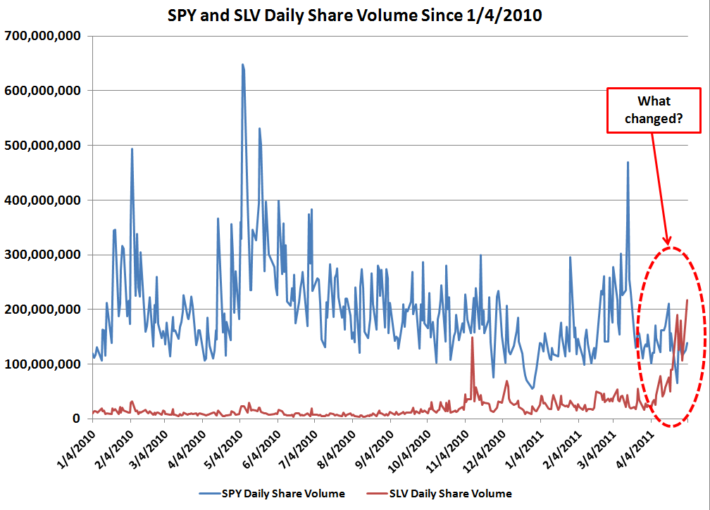
And finally, the comparison of SPY share volume to SLV share volume. Enjoy and a tip of the hat to Mike in Long Island of the CR commentariat for the shares outstanding data!

Wednesday, May 4, 2011

Tuesday, May 3, 2011

New Record in Daily Trading Volume for SLV


Another record set today in volume of shares traded and percent of outstanding shares traded in a single day.

Chart refresher, the right hand axis is shares outstanding (blue area and blue numbers on right axis), the left axis is percent of the outstanding shares traded on a particular day (red line and red numbers on left axis). The average line is the arithmetic average of all days for period covered (green), and the monthly MA line is a moving average of 22 trading days (orange).

Bon appetit.

Edit: adding a somewhat longer view of the same dataset where there appears to be a distinct change in the volume traded as the price ramp got underway in September, 2010.


Monday, May 2, 2011

Daily Trading Volume of SLV vs. Shares Outstanding Redux


Once more, and with a hat tip again to Mike in Long Island of the CR commentariat.

Wednesday, April 27, 2011

Daily Trading Volume for SLV


This post began as a conversation with a data request to the commentariat over at Calculated Risk, and exists because of the generous assistance of Mike in Long Island - hats off to you, Mike!

It seemed to me that the daily volume of shares traded in the silver ETF SLV was quite high, but I did not have the time series data of the daily shares outstanding (a moving target with an ETF such as SLV).

So, from the start of 2010 through today, is the daily shares outstanding (right axis, in blue) and the percent of those shares outstanding that the daily trading volume represents (left axis, in red). For comparison the total arithmetic average is included along with a monthly moving average.

Readers may draw their own conclusions, but there appears to be two distinct periods with the higher volume period starting around the beginning of November, 2010. And recently, the daily traded volume has been quite high compared to the rest of the data in the time period covered.