Thursday, October 30, 2014

Trends in World Health Organization Situation reports: Ebola response roadmap

There are some particularly encouraging trends emerging in the WHO sitreps on the West Africa ebola outbreak, which suggest a break from the exponential curve and increase in the doubling time initially seen.

Using the data from the reports on the total number of cases and the percentage of cases in the past 21 days, we see this for the total number of cases:


Early on, we were near 50% for total cases - if we took 50% as the value (to keep the math easy), that would have indicated that cases had doubled over the last 21 days as of that report.  As of the last sitrep, if that number was about 25% (math simplification op. cit.), which would indicate a doubling time about twice as long.  At the value of 20% that we observe, this would ballpark a doubling time about 2,5 times as long.

Disaggregating the data by country is revealing, with what appears to be unambiguous slowing of transmission in Liberia:


Somewhat equivocal slowing in Sierra Leone:


And re-acceleration in Guinea:


These conclusions are all subject to the accuracy of the data collection, but it would seem that as more world attention and resources begin to be focused on stopping the current outbreak that initial signs of improvement can be seen.  This should not lead to complacency but rather encourage the investment of additional resources.

Data source:
WHO Situation reports: Ebola response roadmap

Saturday, July 20, 2013

Gasoline price update


So once again we'll take a look at the US All Grades weekly average price per gallon, and my fixation with the 52 week moving average (MA).  This makes sense to me as a proxy for the annual cost of gasoline to US households at most aggregate level.

Takeaway is on the plot above - for the last 1.75 years that 52 week MA has exceeded the peak 52 week MA from 2008 - even though we have avoided the national average cost per gallon of $4.00/gallon.  I will posit this is a big part of what is driving several trends, from the largely flat Vehicle Miles Travelled (VMT) to the reduced rate of driver's license acquisition to the move to city cores (particularly in intersection with wretched employment and wage statistics for youth and new college grads).

Additionally, the experience of the impact across the US consumer economy will vary dramatically by income quintile as a function of the amount of disposable income (or what would otherwise be disposable income) these sustained high prices absorb.  I admit to having a jaundiced view of US reported consumer sales growth as the pool of reporting companies has been reduced by those who have chosen to no longer report them (with no attempts to correct for survivors' bias).

Finally, the great China rebalancing may be underway, which would materially reduce commodities demand in general.  The picture seems less clear on the impact for oil and gasoline prices, as the increase in purchasing power for the consumer sector that a rebalancing would represent suggests increased demand for status and lifestyle purchases.  At the current time, automobiles appear to be high up on that list.

[Side bar:  It is difficult for me to see a sustained period of low oil prices due to the likelihood of increased instability in many exporting countries - current social spending needs to mollify populations require high prices to maintain - once currency reserves are exhausted and the ability to borrow/sell forward...]

Wednesday, May 29, 2013

Space. the final frontier... ARKYD Kickstarter from Planetary Resources


OK, for any STEM nerds out there this is just cool:

ARKYD Space Telescope Kickstarter from Planetary Resources

Please feel free to repost the link - oh yeah, and throw some pennies in the pot - for $25 they will take a picture you provide that will displayed on a screen on the telescope in space with the Earth in the background.

Friday, February 15, 2013

Retail Gasoline Prices Revisited

Been awhile, but here is an update of the all in average retail price per gallon of gasoline in the USA.  I like to look at the 52 week MA as a proxy for the cost of gasoline over the last year... and we have sustained an a 52 week MA in excess of the 52 week MA from the 2008 price spike for 1.33 years,

So for more than a year, the annual cost of gasoline has exceeded the maximum annual cost from the 2008 peak.  Expect to see continuing declines in gasoline demand in the USA.

Tuesday, August 21, 2012

Philly Fed 3 Month Coincident Diffusion Indices


So I was looking at the Philly Fed conincident indices for the states on Calculated Risk this morning, and it got me to thinking I wanted to dig into the numbers... (usually when the trouble starts).  Above, we have the 1 month and 3 month diffusion indices for the state coincident indices from the Philly Fed.


I wanted to see more trend activity and reduce the noise, so I took the 3 month diffusion index and examined the quarter over quarter (or 3 month) change in that value, plotted against NBER called recessions in the time series data available.

Conclusion:  I observe a change of -50, a value that has previously only been represented in recessions.

Sunday, August 5, 2012

Motor Gasoline Prices Revisited

A quick look at motor gasoline prices, trying to assess whether the cumulative impact of the price trajectory has been more severe than in 2008.  This appears likely, though it will be a long grind down.  Using the monthly price series for all grades of gasoline from the EIA, and looking at the 12 month moving average (MA).  It surpassed the 12 month MA peak from 2008 10 months ago and has stayed there since.

Saturday, April 21, 2012

Price for Motor Gasoline in 2012

So there has been huge amounts of financial press discussion of motor gasoline prices, and the prospects for relief for the remainder of 2012. I decided to take a look at the data, and based on the EIA data series for the price of all grades, all formulations the prospects decidedly favor paying more, not less for the remainder of the year.

Using monthly price data, I took the average for the first three months (1Q of each year), the annual average, and the average of the remaining nine months (2Q to 4Q of each year). The linear fits for 1Q vs full year and 1Q vs 2Q to 4Q are at the end of the post, but those results provided the point estimates seen in the plot below (the EIA data series EMM_EPM0_PTE_NUS_DPG).

Punchline: $3.97/gallon for the full year, and $4.07 for the remaining nine months.

What we see is that in in only 4 of the 18 years (1994 to 2011) did annual average gas prices decline from the first quarter, and when they did the maximum decline for the full year average price was 2%, and for the 2Q to 4Q average price it was 3%.

The confidence interval results from the linear regression for the point estimates follow:


 The aforementioned data plots:

Monday, March 19, 2012

Ten Year Treasury Plot


The current "bond-pocalypse" in progress - a little perspective - that is all...

Friday, March 16, 2012

Real Disposable Income Per Capita

So how does the current recovery stack up against other recoveries? One measure that seems meaningful to me is real disposable income per capita - rather than staring blankly at aggregate measures that ignore population growth - what kind of purchasing power to individuals have after the necessities? (and even this ignores distribution issues)

So courtesy of the good people at BEA (Bureau of Economic Analysis) we have here Series A229RX0, Real Disposable Personal Income: Per capita in chained 2005 dollars. I've smoothed it a bit with a three month moving average to reduce the noise.


Now I wanted to look at year over year changes (yes yes even though this is a seasonally adjusted series) to see what kind of annual growth is being experienced in this measure of economic well being.

So things look a bit anemic for the last several months.


And the question occurred to me, how to compare the year over year performance of this measure over the course of this recovery in comparison to other recoveries, so I normalized to the start dates of the respective recoveries since 1980. One note, as we are in month 31 of the current recovery, when we index the 1980 recovery the subsequent 31 months include the entire second recession of the "double dip".

The thing that really grabbed me I've highlighted in the callout is that the 1980 recovery outperformed the current recovery with respect to this metric - by 70% for the period of the second recession - that is, real per capita disposable income growth in the second recession of the "double dip" outpaced the growth in the current recovery over 70% of the time during the period of the second recession, and 84% of the time over the course of the entire 31 months that corresponds to the latest data point available in the current recovery, January, 2012.

Finally, I have to wonder what this looks like when it is broken out by income quintiles...

Friday, March 2, 2012

Whither Commercial Paper?

So it has been awhile since I took a look at commercial paper, so I wandered over to the FRB Outstandings web site to take a look... this is the non-seasonally adjusted (NSA) weekly data in a 4 week moving average (MA).


So the recovery begins more or less where the total outstanding amount approximatley flatlines after the kickoff with the epic ablation of asset backed commercial paper.


NSA data is well suited for looking at year over year changes, so we'll start looking at the year over year change in the 4 week MA of the total amount of commercial paper outstanding on a NSA basis.

As we can see, the total amount of outstanding commercial paper began to decline on a year over year basis around the end of 3Q2011.


Commerical paper is a 1 to 270 day promissary note, broadly bucketed into three categories: financial, asset backed and non-financial in order of amount outstanding. Financial commercial paper is issued by financial institutions of varying stripes, non-financial is any other type of institution and typically used to finance inventories, while asset backed commercial paper is issued from a bankruptcy remote SPV that sells the paper to purchase the assets from the financial institution (general descriptions, anyone who would like to add to that please do so in the comments). So a year over year look at the different categories:

We see that:
1. Asset backed commercial paper has yet to go positive on year over year basis since the onset of the Great Recession
2. Financial commericial paper went negative on a year over year basis around the end of 3Q2011
3. Non-financial commercial paper is showing strong growth on a year over year basis, though that appears to be decelerating

The strength of the non-financial commericial paper is encouraging, given its place in the real economy. However, in the onset of the Great Recession we saw that it was the last of the categories of commercial paper to decline on a year over year basis, and it currently constitutes 18% of the outstanding amount.

So what do you think this means?

Friday, February 3, 2012

Different This Time Redux - Labor Force Declines

First posted on this back in February of last year:
Different This Time - More on Labor Force Declines

Here is the update with another year of annual data from BLS Series LNU00000000, LNU01000000 and LNU05000000:


In summary, it is clearly different this time, as only 2009, 2010 and 2011 year over year changes show consecutive declines in the size of the labor force and consecutive year over year increases in the not in labor force greater than the increases in population. The pace of the change suggests more than demographics to me, and as Barry R. says, "What say ye?"

Monday, November 21, 2011

DOT Miles Driven: Overlay 2007-2011


Things that make me go hmmm... I tend to take that view that the economy is a heat engine, this looks like less heat to me... along with this:

IEA Oil Market Report US Motor Gasoline Demand

Here is the data source, go to September 2011 and click on the .xls version - you will find it on the Data tab in column I - enjoy!
US DOT Data Source

Friday, November 11, 2011

We Will Be Exploring the Limits of Storage for Natural Gas


So I've been watching storage for the natty for some time now, and it struck me that I should put up a post on it as I think we are about to explore the physical limits of the natural gas storage system in the USA...

Thanks to the good people at the EIA, I downloaded the data for natural gas storage levels from their weekly report (Thursday mornings). I constructed a 4 week moving average to smooth things out a tad and then looked at the month over month change on a percentage basis, with each year set up as an overlay.

Short version: we are coming in 'hot', and in absolute terms the last storage report was 0.2% under the previous all time high, I expect we punch through next week (I may get expelled from the economics profession for calling both direction and time). Will coal switching provide sufficient demand to set the price floor this time around?


I've added this plot to illustrate what I have been talking about - here are 12 month moving averages for natural gas production and the front month Henry Hub natural gas contract - note the divergence and even the accelerating natural gas production as prices grind lower... and lower...

Saturday, October 22, 2011

U-3 Unemployment Rates from Recession Peak to Expansion Trough


Some descriptive statistics of the behavior of U-3 across all post-WWII business cycles using UNRATE and the NBER cycle dating.

The top of each red column corresponds to the peak in the U-3 unemployment rate associated with a particular recession, typically happening after that recession has ended. The lower end of each red column corresponds with the trough in the U-3 unemployment rate experienced prior to the onset of the next recession... note that for the last bar on the chart, the current trough is provisional (the low to date was 8.8% in March, 2011 while in September, 2011 that is 9.1%).

Thursday, August 11, 2011

DJIA Volatility - What Next?


So is this the start of something?

First, what we are looking at - a five day intra-day range of the DJIA divided by the five day average of the close - and the absolute level of the Dow 30 index.

Now, what next? Note the observation of the shorting ban is roughly contemporaneous with the Lehman failure... no claims as to causality, but we may be getting some additional insight into that with the recent moves by several markets within the EU to ban shorting... time will tell.

Friday, July 8, 2011

UEMPMEAN - UEMPMED: Structural Unemployment


So using the mean and median weeks of unemployment time series data from the Fed FRED, here is what the spread between the mean time and median time looks like... so as mean times increase relative to median times, this would seem to indicate either a larger sub-group of long term unemployed, or that sub-group is experiencing longer durations of unemployment, or both.

What changed in the 2001 recession that resulted in a higher floor for the spread?

Tuesday, July 5, 2011

US Regular Gasoline Price - Perspective


Courtesy of the EIA data set on the monthly average price for regular gasoline, above is a plot of the 12 month moving average...

Wednesday, May 18, 2011

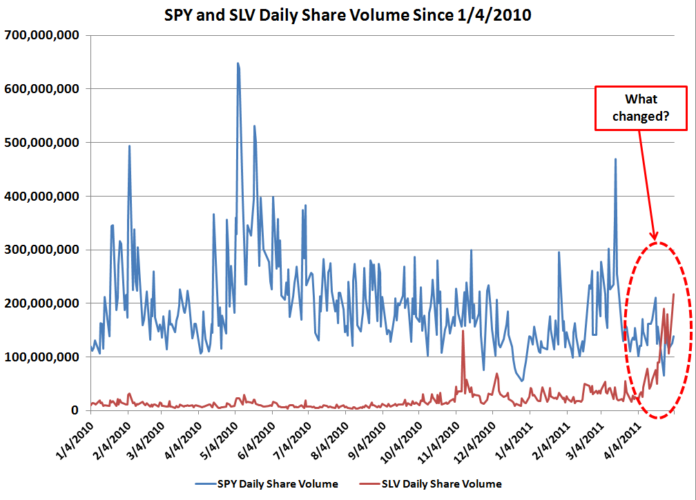
SLV % of Shares Outstanding Traded Daily Redux


First, we have about a 16 month view of the shares traded as a percent of outstanding...


Next, we are looking more closely at my SWAG at the region where the share volume appears to be 'different'...


Here we have the 10, 30 and 90 day daily moving averages of the share volume...


And finally, the comparison of SPY share volume to SLV share volume. Enjoy and a tip of the hat to Mike in Long Island of the CR commentariat for the shares outstanding data!

Wednesday, May 4, 2011

Tuesday, May 3, 2011

New Record in Daily Trading Volume for SLV


Another record set today in volume of shares traded and percent of outstanding shares traded in a single day.

Chart refresher, the right hand axis is shares outstanding (blue area and blue numbers on right axis), the left axis is percent of the outstanding shares traded on a particular day (red line and red numbers on left axis). The average line is the arithmetic average of all days for period covered (green), and the monthly MA line is a moving average of 22 trading days (orange).

Bon appetit.

Edit: adding a somewhat longer view of the same dataset where there appears to be a distinct change in the volume traded as the price ramp got underway in September, 2010.